Contact Us page redesign
From Hackathon concept to Aetna Health’s 2021 roadmap
What problems were we solving?
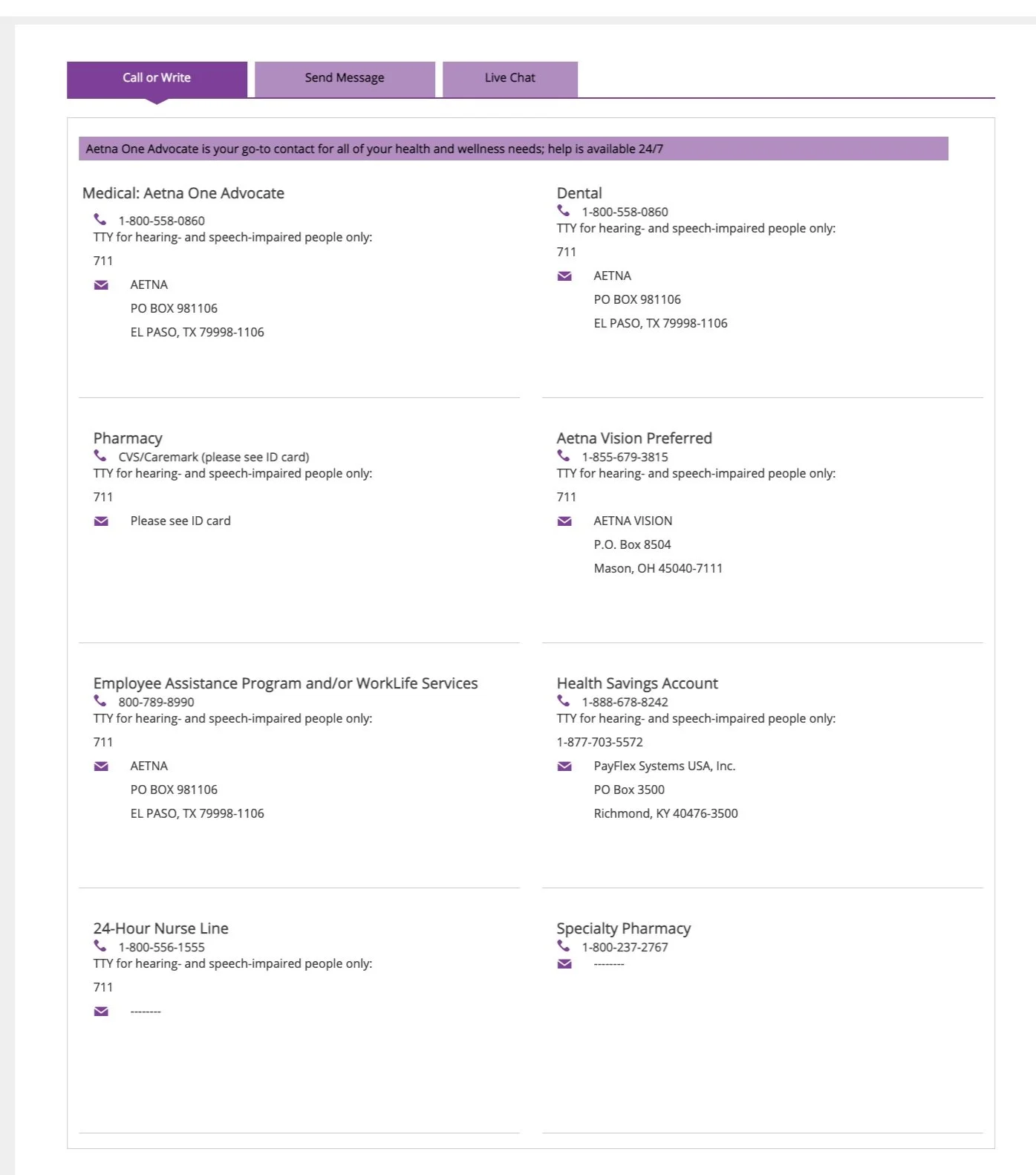
The previous Contact Us page was an unorganized collection of phone numbers and addresses, so our members had a hard time finding the help they needed.
Members didn’t have a way to find answers to common questions about their health insurance.
The original page was sterile and uninviting.
Our design process
To facilitate brainstorming, collaboration, and content iterations, we chose Figma.
We completed a competitive and comparative analysis of well-designed and informative Contact Us pages.
Our team interviewed other designers to gather customer background info and FAQs we could apply to the page.
We only had two days to work on our project, so we designed for the most commonly-used desktop breakpoint at the time.
My Hackathon role
I submitted the Contact Us redesign idea to the Hackathon committee and garnered interest from other designers I hadn't worked with yet.
I was the SME on voice & tone and created all UX content, other than the FAQs we reused from another team’s project.
I consulted with a lead UX designer on a related project to discover the history of chat and secure messaging features.
I presented our concept to over 100 employees of Product, Design, and Engineering.

The results
We won the “Immediate Member Impact” category.
Our Contact Us page inspired a new support page on the 2021 roadmap.
Our promotion of Figma helped the Aetna Health Design Ops team move from Sketch to Figma.
Although our design didn’t exactly follow brand guidelines, our dog was a hit and brightened everyone’s day.